Plotly.jsのサンプル(誤差棒付き時系列データ)
JavascriptのプロットライブラリPlotly.jsがオープンソース化された(オフィシャルの発表; 日本語記事)ので、雷雲ガンマ線観測実験のデータをブラウザ上で表示するために使ってみました(以前記事にした最近流行りのプロットライブラリd3.jsを使うこと考えましたが、簡単なことをしたい時には大げさすぎるので今回はPlotly.jsです)。
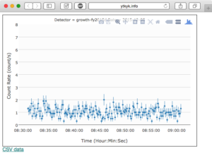
プロットしたいデータはガンマ線/宇宙線の5秒毎のカウント数の時系列です。元データはROOT形式ですが、サーバ側でCSVに変換して、Plotly(というか、その内部で動いているd3.js)が読めるようにしています。
CSVデータは以下のように、時刻、カウントレート、統計誤差が並んでいます。
1
2
3
4
5
6
7
8
Time,Rate,RateError
2015-12-05 08:30:59,1.3,0.11
2015-12-05 08:31:09,1.1,0.33
2015-12-05 08:31:19,1.2,0.35
2015-12-05 08:31:29,1.2,0.35
2015-12-05 08:31:39,1.7,0.41
2015-12-05 08:31:49,0.7,0.26
2015-12-05 08:31:59,1.5,0.39
プロット結果と使用したCSVファイルは以下から見れます。
plotCSVTimeSeriesDataWithErrorBar.html (誤差棒付きのプロット)
20151205_083054_ch0.csv (ガンマ線/宇宙線の時系列データ)
ソースコード
1
2
3
4
5
6
7
8
9
10
11
12
13
14
15
16
17
18
19
20
21
22
23
24
25
26
27
28
29
30
31
32
33
34
35
36
37
38
39
40
41
42
43
44
45
46
47
48
49
50
51
52
53
54
55
56
57
58
59
60
61
62
63
64
65
66
67
68
69
70
71
72
73
74
75
76
77
78
79
80
81
82
83
84
85
86
87
88
89
90
91
92
93
<html>
<head>
<script src="https://cdn.plot.ly/plotly-latest.min.js"></script>
</head>
<body>

<div id="lightcurve" style=" padding: 10px; width: 600px; height: 400px; border:solid 1px black;">
</div>

<script>
	//data source
	var csvFileURL="http://ytkyk.info/blog/wp-content/uploads/2015/12/20151205_083054_ch0.csv";

	//plot setting
	var yMin=-0.2;
	var yMax=8;
	var lineNumber=0;
	var bgColor="#fcfcfc";
	var gridColor="#d0d0d0";
	var yLabel="Count Rate (count/s)";
	var xLabel="Time (Hour:Min:Sec)";
	var xTickFormat="%H:%M:%S";

	//info of plotted data
	var startTime=""
	var detectorID="growth-fy2015d"

	//do plot
	Plotly.d3.csv(csvFileURL, function(rows){
		//prepare title
		startTime="Detector = "+ detectorID +" Date = "+rows[1]["Time"].split(" ")[0];

		//create trace (data series to be plotted)
	    var trace = {
	      type: 'scatter',
	      mode: 'markers',
	      hoverinfo: "none",
	      textfont: {
	      	family: "Helevetica Neue"
	      },
	      x: rows.map(function(row){
	        return row['Time'];
	      }),
	      marker: {
	      	symbol: "circle",
	      	size: 5,
	      	//color: "#FF0000"
	      },
	      y: rows.map(function(row){
	        return row['Rate'];
	      }),
	      line: {
	        width: 1,
	        //color: "#00FF00"
	      },
	      error_y: {
	        array: rows.map(function(row){
	          return row['RateError'];
	        }),
	        thickness: 1,
	        width: 0
	      }
	    };

	    //create layout
	    var layout = {
	      title: startTime,
	      titlefont: {size: 12},
	      plot_bgcolor: bgColor,
	      yaxis: {
	      	title: yLabel,
	      	showgrid: true,
	      	gridcolor: gridColor,
	      	range: [yMin,yMax]
	      },       // set the y axis title
	      xaxis: {
	      	title: xLabel,
	        showgrid: false,
	        tickformat: xTickFormat
	      },
	      margin: {
	        l: 40, b: 50, r: 10, t: 20
	      }
	    };

	    //do plot
	    Plotly.plot(document.getElementById('lightcurve'), [trace], layout, {showLink: false});
	});
</script>

<span style="font-family:'Helvetica Neue', Arial"><a href="/blog/images/2015/12/20151205_083054_ch0.csv">CSV data</a></span>
</body>
</html>
データを読み込んでX/Y/errorYを準備し、レイアウト指定情報を作成して最後にプロットを作成するところで、
1
Plotly.plot(document.getElementById('lightcurve'), [trace], layout, {showLink: false, staticPlot: true});
のように、configurationとして
staticPlot: true
を追加すると、プロットにマウスをホバーした時に表示されるメニューバー(アイコンが並んだツールバー; 下記)を消すことができます(検索してもなかなか答えが見つからなかったので書いておきます)。
