matplotlibのテンプレート(Rubyユーザ向け?)
仕事の都合でPython (numpyとmatplotlib)を使わないといけないのですが、numpyの関数スタイルとmatplotlibのオブジェクト指向がなかなかなじめなくて効率が悪いなーと思っています(毎回ウェブで書き方を調べないといけない)。matplotlib.plotの関数とaxesの関数で名前が違う(set_xlim()とxlim()とか)のがすごくややこしい。
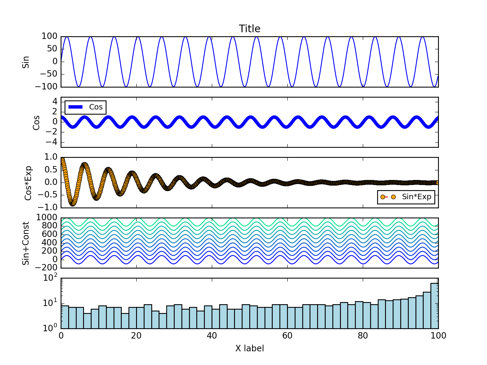
とりあえず、軸ラベルの設定やスケール(lin/log)の変更など、やりたいことがすぐできるように自分用のメモ。以下のスクリプトを実行するか、Jupyter notebookにコピーペーストして実行すると、下のような図ができます。
RubyやROOTのオブジェクト指向に慣れている人は、以下の方法でfigとpanel (オフィシャルにはaxesと呼ばれている)を最初に作って、panelに対してplot()やset_xlim()をコールするほうが理解がスムーズだと思います。
FigureオブジェクトとAxes (プロット用のpanel)の生成
1
2
# Figure and panel objects
fig, panels = plt.subplots(5, 1, sharex=True)
ソースコード全体: 1枚のプロットに複数のパネルをつくる例
gistからもダウンロードできます。
1
2
3
4
5
6
7
8
9
10
11
12
13
14
15
16
17
18
19
20
21
22
23
24
25
26
27
28
29
30
31
32
33
34
35
36
37
38
39
40
41
42
43
44
45
46
47
48
49
50
51
52
53
54
55
56
57
58
59
60
# Jupyter notebook環境で実行するときは、以下の「%matplotlib inline」の
# コメントアウトを解除すると、プロット結果がインラインで表示されます。

# %matplotlib inline

import matplotlib.pyplot as plt
import matplotlib.cm as cm
import numpy as np

# Set script-wide font size
plt.rc("font", size=10, family="Helvetica")
params = {'legend.fontsize': 9 }
plt.rcParams.update(params)

# Figure and panel objects
fig, panels = plt.subplots(5, 1, sharex=True)

# Plotted data
x     = np.arange(0, 100, 0.1)
y_sin = np.sin(x)*100
y_cos = np.cos(x)
y_cos_exp = np.cos(x) * np.exp(-x / 20.0)

# Labels
panels[0].set_title("Title")
panels[-1].set_xlabel("X label")

panels[0].set_ylabel("Sin")
panels[1].set_ylabel("Cos")
panels[2].set_ylabel("Cos*Exp")
panels[3].set_ylabel("Sin+Const")

# Set range
panels[-1].set_xlim(0,100)
panels[1].set_ylim(-5,5)

# Set log
panels[4].set_yscale("log")

# Plot
panels[0].plot(x, y_sin)
panels[1].plot(x, y_cos, linewidth=4)
panels[2].plot(x, y_cos_exp, color="red", linestyle="dashed",
               marker="o", markersize=5, markerfacecolor="orange")

# Plot with color-map colors
# autumn, bone, cool, copper, flag, gray, hot, hsv,
# jet, pink, prism, spring, summer, winter, spectral
for i in range(0,10):
	color=cm.winter(float(i) / 10)
	panels[3].plot(x,y_sin+i*100,color=color)

panels[4].hist(y_sin,bins=100,color="lightblue")

# Legend
panels[1].legend(["Cos"],loc="upper left")
panels[2].legend(["Sin*Exp"],loc="lower right")

# Save
fig.savefig("sample.png", dpi=200)